


There’s a massive amount of information circulating online about the eruption of Mount Agung. Different news sources coming up with different headlines and a whole variety of statistics. It can be hard to discern, from the sensationalised articles coming out of the mainstream media, what the reality of the situation is. It’s an overwhelming process to navigate through the onslaught of information being posted on social media. Since Agung began to rumble back in September, we have gathered some great resources to use to find the facts about the Mount Agung eruptions. We’ve utilised them to keep you up-to-date on social media and even in our previous blog posts on the topic. They offer up-to date information and statistics about the situation and are the best way to gauge what is happening now, and what may be expected. It’s easy to go down the rabbit-hole of research when looking through all of the resources. So we’ve compiled this list of, what we think are, the most helpful resources so you can effortlessly see what the latest on the Island of the Gods. Don’t be dissuaded by the fancy graphs, if we can learn ’em… you definitely can!
1. ‘BALI VOLCANO ERUPTION AGUNG 2017’ FACEBOOK PAGE
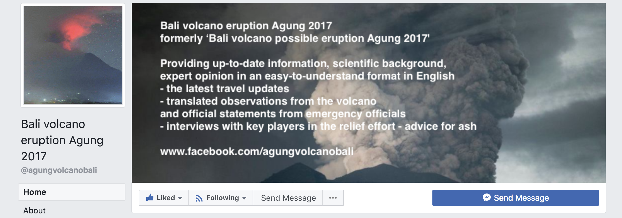
This is the best go-to for an overview of volcano-related updates. Managed by Keith Lyons, who has worked with Red Cross in China after a major earthquake and with environmental ministries, regional government and local authorities on disaster preparedness in New Zealand, China and Myanmar… this guy knows his stuff and knows where to find the facts! Keith created this page after providing valuable information on Facebook, back in September, about how to prepare for the eruption. The Facebook Page provides regular easy-to-read updates that stick to the facts, with a sprinkling of humour to lighten the mood. If you don’t want to comb through all the individual resources by yourself, this is the best location to head for a general overview of recent news.
There’s a massive amount of information circulating online about the eruption of Mount Agung. Different news sources coming up with different headlines and a whole variety of statistics. It can be hard to discern, from the sensationalised articles coming out of the mainstream media, what the reality of the situation is. It’s an overwhelming process to navigate through the onslaught of information being posted on social media. Since Agung began to rumble back in September, we have gathered some great resources to use to find the facts about the Mount Agung eruptions. We’ve utilised them to keep you up-to-date on social media and even in our previous blog posts on the topic. They offer up-to date information and statistics about the situation and are the best way to gauge what is happening now, and what may be expected. It’s easy to go down the rabbit-hole of research when looking through all of the resources. So we’ve compiled this list of, what we think are, the most helpful resources so you can effortlessly see what the latest on the Island of the Gods. Don’t be dissuaded by the fancy graphs, if we can learn ’em… you definitely can!
2. ‘MOUNT AGUNG DAILY REPORT’ FACEBOOK GROUP
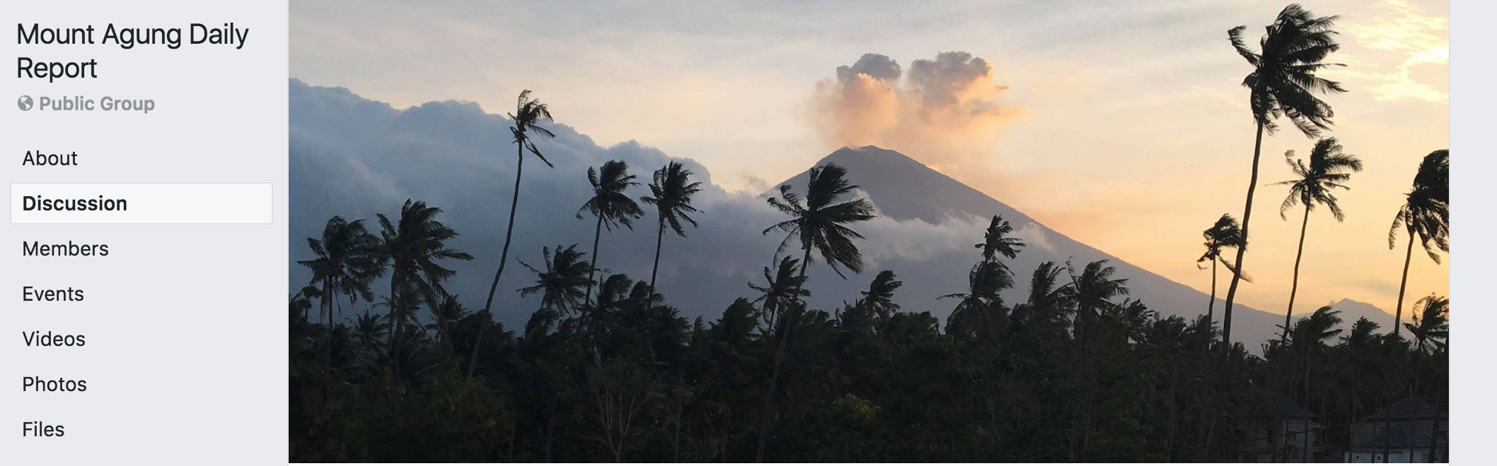
Created by Jackie Pomeroy (a.k.a. the queen of all volcano knowledge) , this group was created to divert all of the Agung questions from other groups into one specific location. Each day Jackie checks in with her knowledgable sources and provides a report of what’s going on with mighty Agung in laymens terms. This is the best place to go for regular updates.
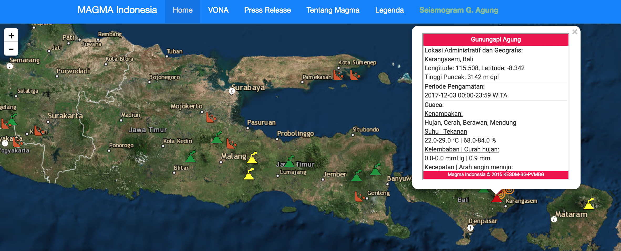
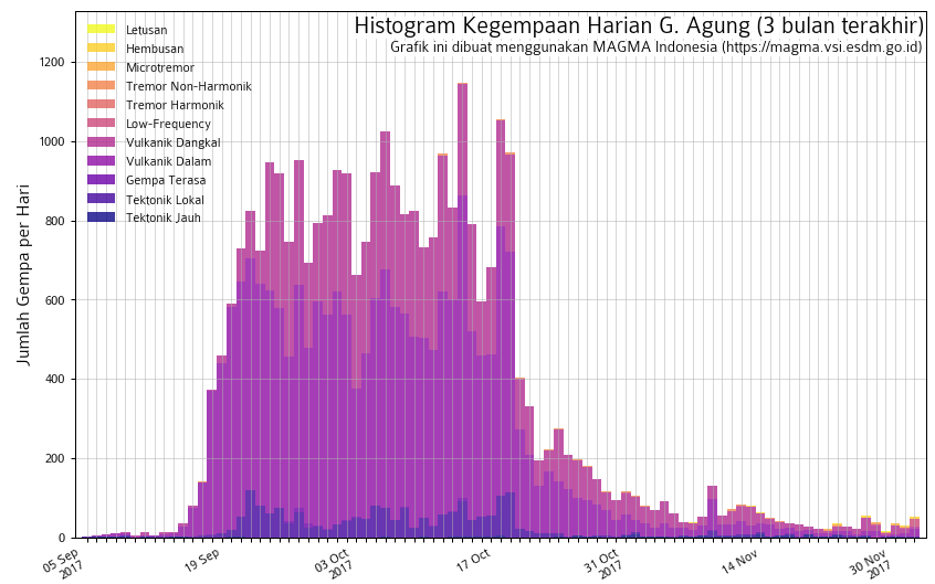
Magma Indonesia is an official website from the PVMBG (Pusat Vulkanologi Mitigasi Bencana Dan Geologi)… in English; Volcanology Center for Disaster Mitigation and Geology. The website is a Google Maps style layout with graphics of all the volcanos in Indonesia. A cursory glance reveals why they call this area the ‘ring of fire’. Zoom in towards Bali to find Mount Batur (green) and Mount Agung (red), the circle graphics surrounding them represent recent earthquakes. Click on any of the symbols to reveal more information. Scroll through the info for summaries in both Indonesian and English. Here, you can find the colour of the aviation alert (RED generally means the airport is likely to be closed) along with a graph that demonstrates levels of volcanic activity (pictured; left). The graph reveals that activity was at it’s highest between September & October.
You can also find recent press releases from the PVMBG on this site (see menu). But you’ll need the aid of handy Mr. Google Translate if you can’t read Indonesian.
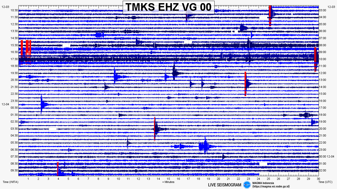
How amazing is technology? Back in 1963 they had nothing like this to track what is happening. Today, we have accesses to this live seisogram being produced by a seismograph that is continuously registering the size and frequency of tremors coming from Agung. It’s pretty straight forward to understand. In laymens terms (because, hey, that’s all we know!)… little squiggles equal little activity and big squiggles equal big activity. The time and dates are posted vertically either side of the gram. When the measured amplitude is greater than what the seismograph can print (i.e. 20mm), the graph turns red and those sections are referred to as overscale.
This is a pretty cool tool to geek out on, but please note that the tremors you are seeing here are happening inside the volcano and not all over the island. There have been days where the seismograph recorded red for over an hour, yet Agung did not go BOOM in that time. So whilst you may enjoy nerding it up with some science… don’t become attached to determining conclusions from these measurements. That’s for the volcanologists to do!
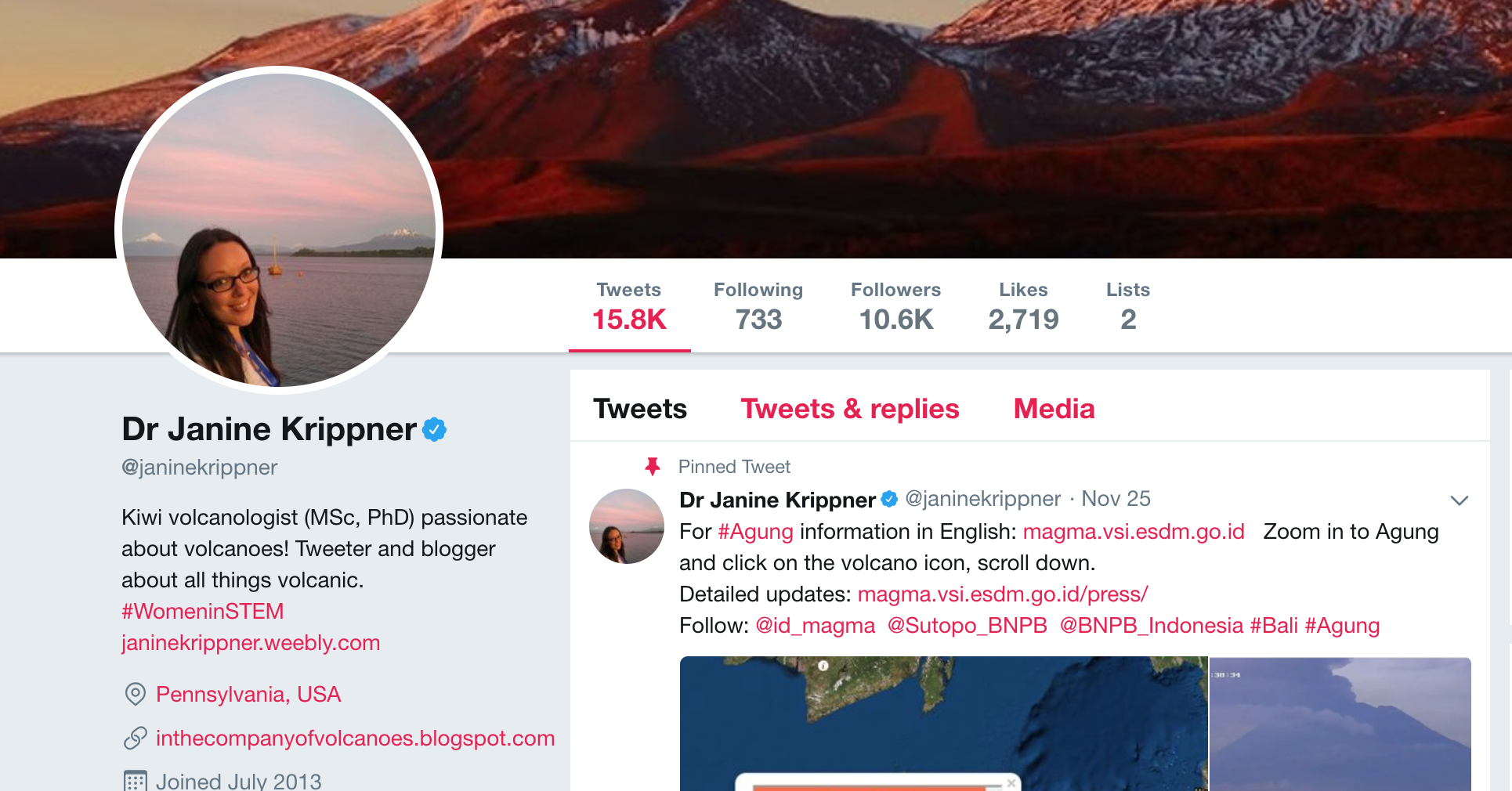
If there is anyone we are fan-girling over at the moment it is volcanologist, Dr. Janine Krippner. Her twitter account has all the #facts shortly summarised into delicious twitter-sized packages. An easy scroll through her account will reveal current updates, links to relevant resources, tips for dealing with ash and updates about the airport. Her easy to read posts are informative and scientific, without being hard to understand. She is even de-bunking myths when fake or misleading photos of Agung pop-up. Dr. Krippner also has a super informative blog called ‘In the company of volcanos’.
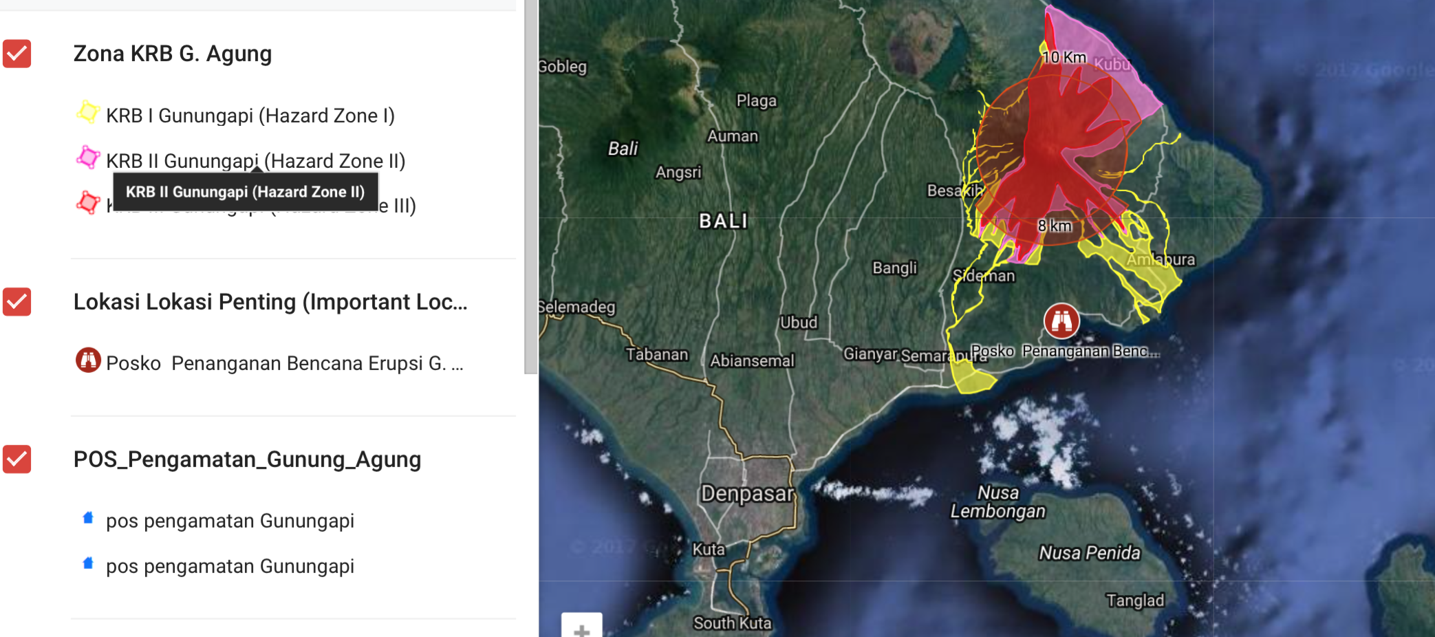
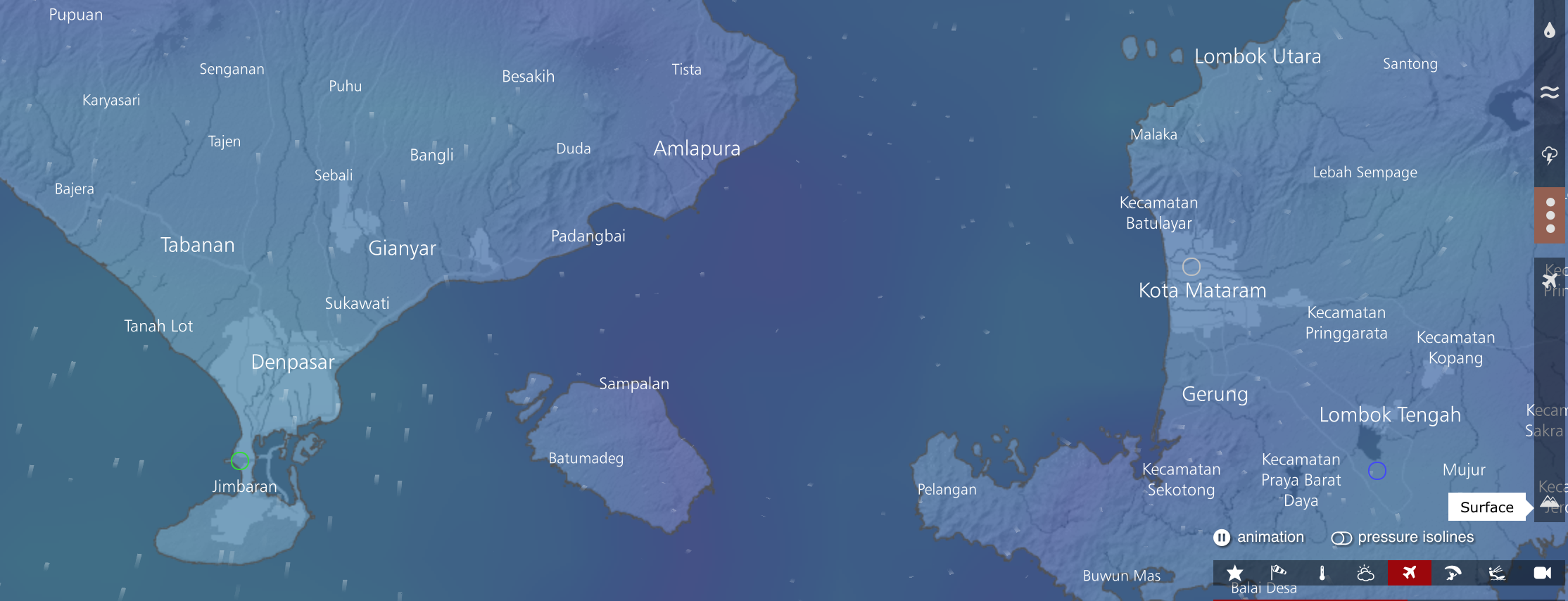
This map reveals the current exclusion zone (red circle) and the potentially hazardous areas during an eruption. Whilst it looks like there is lava flowing over the island, this isn’t actually the case. It is an educated projection of what could happen in a worst-case-scenario explosive eruption. Please note that whilst the map displays the current exclusion zone, it is advised that foreigners remain at least 15km away from Mount Agung, so as to not interfere with evacuation procedures.
NOTE: This does not work on Google Chrome apps or browsers. However, the link can be opened in the Google Maps app.
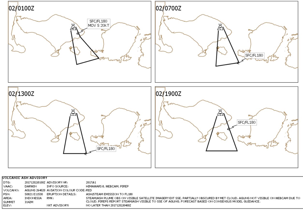
If you’re concerned about the ash cloud interfering with your Bali travel plans, you can check out this resource. Released by the Volcanic Ash Advisory Centre it is a regularly updated diagram that reveals the direction and area of the ash being released from Mount Agung. Wondering what on earth the codes next to the diagram mean? “02/0100Z” The ’02’ refers to the date (in this case, the 2nd of December), and the 0100 is Zulu military time (i.e. 1am in the UTC+0 timezone). Bali is the UTC +8 time zone, so add 8 hours to the time recorded on the map (making 0100Z = 9am in Bali).
NOTE: If there is no documents available at the link provided it means there is no ash in Bali at that time.
Incase you want to monitor the ash cloud even further, you can make an educated guess using this website. ‘Windy’ shows a live view of the direction of the wind over Bali, thus potentially revealing where the ash cloud may travel. You can play around with the functions on the side of the map to reveal a variety of weather variables (unrelated to Agung) such as temperature and waves and our new favourite… rain (hello #rainyseasonhack)!
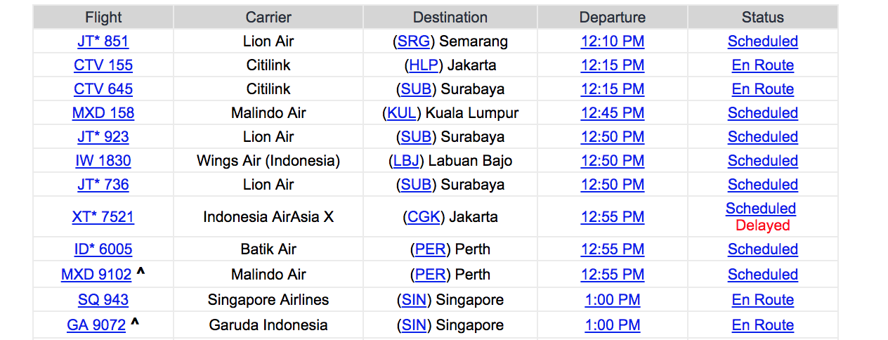
The biggest concern on travellers minds is whether their flight will be cancelled. Whilst, it’s impossible to know the future, you can keep an eye on the status of flights arriving and departing from Ngurah Rai Airport in Denpasar. For more detailed information you will need to refer to your specific airline carrier. Australian airlines are being renowned as first to cancel.
AUTHOR

SARA O’BRIEN
Sara is the founder and editor of UbudHood. Originally from Australia, she has called Bali home for the last four years and has no plans to leave. With a serious love for ‘Ubud’ she has combined her love of writing and background in photojournalism to create UbudHood. She is a strong supporter of ethical tourism and believes it’s our duty, as foreigners, to respect cultures that aren’t our own. When she’s not playing with her puppies or eating her way through the hood, Sara spends her time taking photos, listening to live music or whirring herself into a creative storm of convoluted ideas.